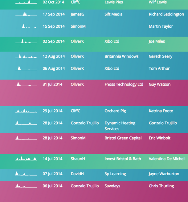
Activity history in a sparkline
Activity history in a sparkline
When looking at a sales-related data such as leads or opportunities, it’s often useful to see not just the data itself but how it’s changed over time. You want to know which opps. are being actively worked, which haven’t had any activity for some time and what conversations are going on with prospects.
Now you can at a glance see not just the last update time, but the ‘shape’ of activity over a period of time. It may look like

a spike of activity at the right, which represents a new record just added to the system,

a record which had a large spike of activity a while ago with only minor updates since, or

which represents a record with a large amount of activity over it’s whole lifetime.
With sparklines next to every record on screen, you can quickly get an idea of the relative activity of each…
The default length of a sparkline is 6 months.
Setting up
To add this sparkline, simply go to the view fields tab for a view in the admin section and add the field called Activity Histogram [Auto] to the view. It often looks best when moved to be the first field in the view.
Feedback
Was this page helpful?
Glad to hear it! Please tell us how we can improve.
Sorry to hear that. Please tell us how we can improve.