Subscribing to charts and reports
Subscribing to charts and reports
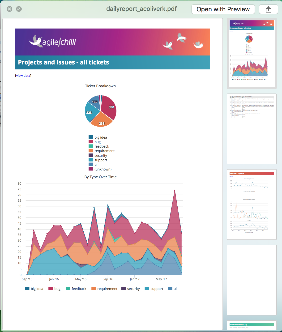
For a few customers, we’ve recently been manually creating reports containing charts and data, that are automatically emailed to managers regularly (once a month or week). This has proved so successful that we’re now introducing a feature to let users create their own reports by choosing charts and data.

It’s really simple to set up -
- view charts as normal (open a tile, select a view and click the charts button)
- select a period - monthly, weekly, or daily
agileBase will then gather together all the charts you’ve chosen to receive monthly and send them to you in a PDF document once a month on the first day of the month, similarly for weeklies and dailies.
Including data
Sometimes, you may want to see actual data instead of (or as well as) charts. To do that, select an option next to the ‘period’ chooser. There are a couple of options to email the top 5 or top 20 rows of data in the view, but if the view includes date fields, the system will also offer to send new records since the last report.
So for example if you wish to see a list of all new customers added to the system every week, find or create a view containing the ‘creation time’ of customer records and the system will offer the following options:

If there are charts in the view, they’ll be included too, if not, just the data will be sent for that view.
Lucky Dip
Many people may not even be aware of what charts exist in the system. Once a month, a random chart will be chosen for each user (from the data that they have access to) and sent to them, whether or not they’re subscribing to any. You never know, that may serendipitously be just what they’re looking for. This will also help to introduce the feature to the many users who may not be reading this blog.
Note: users with data filters are currently excluded, though this may be changed in future.
Other charting improvements
Choosing charts is one thing, but creating them is another. We’ve also been continuously improving this area, increasing the power of the system whilst also improving user friendliness. Some recent updates include:
- the chart creation/editing screen is now separate from chart viewing, cutting down on clutter
- there’s a new option in the menu for saved charts to ’expand’ it. This will show it full screen - many times, users wanted to concentrate on one chart when presenting or interrogating data
As test users have said “Charts creation looks so much better.”
Feedback
Was this page helpful?
Glad to hear it! Please tell us how we can improve.
Sorry to hear that. Please tell us how we can improve.